Kite Next Component Library + Style for TV Platforms
Role
Interface Design (UI)
Year
2021
Platforms
Sketch Library for all TV platforms
The Kite Next TV style library is a soft, subtle and friendly UI that focuses on depth to pull content and functionality forward into the video browsing experience. It carries our core design principles of universal, empathetic, intentional and refined design.
This library is currently being used for our apps on Android TV and Apple TV. It will eventually be used on our TVSDK, iOS, Android and Samsung apps.
UI and core concepts shown in this project were created together with Jared Wolf.

Color Specific for Dark Mode on TV
Spectrum uses dark UI for all of their content consumption apps while the customer portals use light UI.
We introduced some new elevations to our primary brand colors in order to create subtle transitions in our UI for different layers.
The entire color spectrum starts with our base blue #001221. We adopted this color as a background and created all of our greys, lighter blue shades.
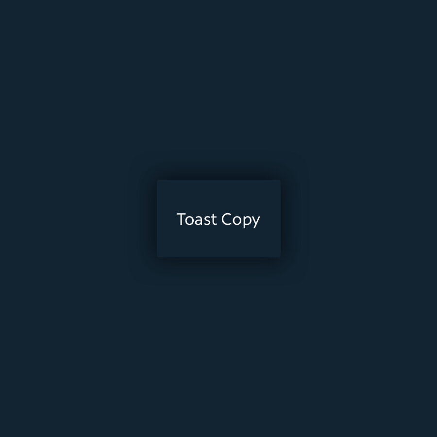
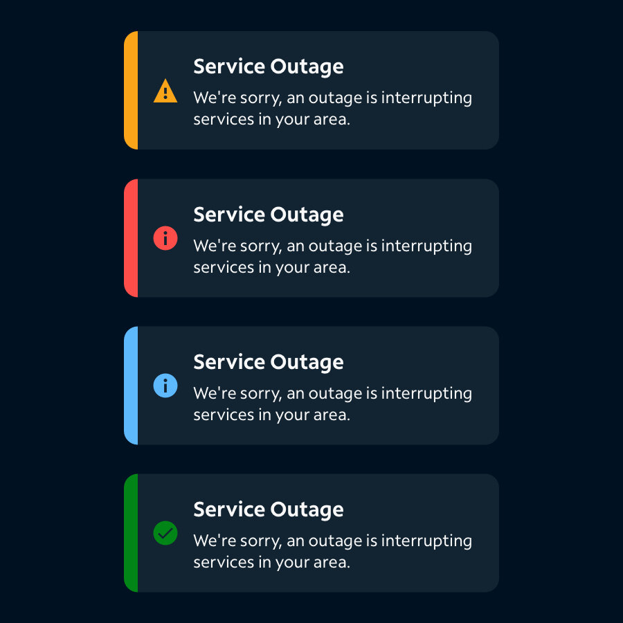
Our tool tip colors contrast harshly with our blue backgrounds in order to stand out for critical errors.
-

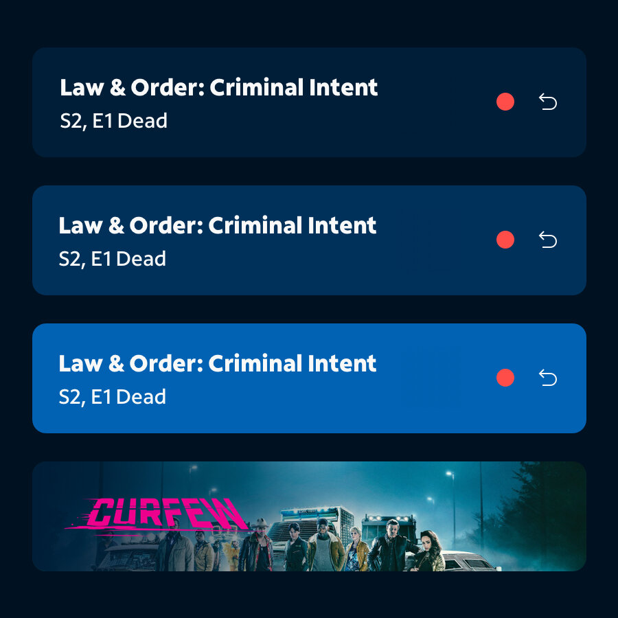
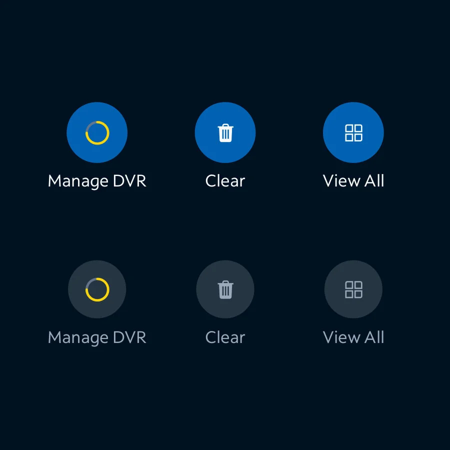
Elevation
To create subtle elevation effects we introduced four colored elevation steps. They are created by adding 4% opacity white on top of the darkest blue 3.
Each step of elevation adds another layer of 4% white and simulates how things that are closer appear lighter in the dark in nature. This works better than just using shadows to show elevation as you might in light mode. -

Shadows
Another subtle effect we also use is apply shadow onto surfaces. The shadows in the dark theme have about 90% transparency black color unlike light themes where transparency can be as low as 6%. Not all surfaces always need a shadow but it helps hover and focus states, and provides elevation from the bottom layer.=
The shadows can especially help with there is a video or image behind the main background layer which often lightens up the background and makes the elevations harder to distinguish. -

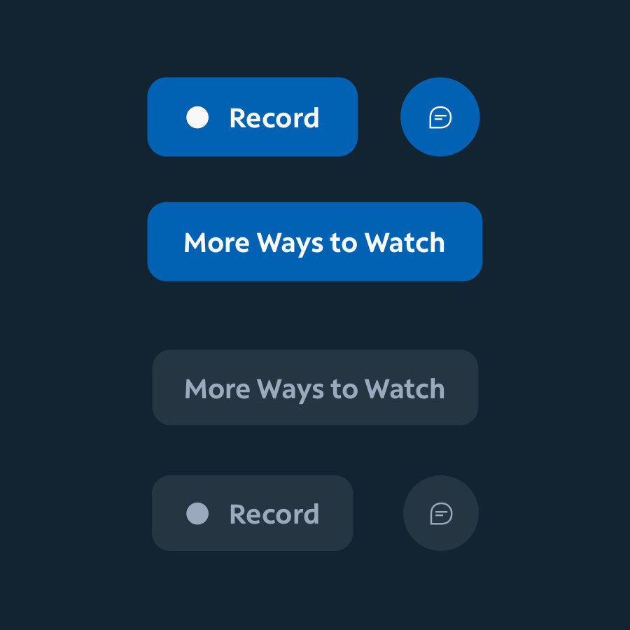
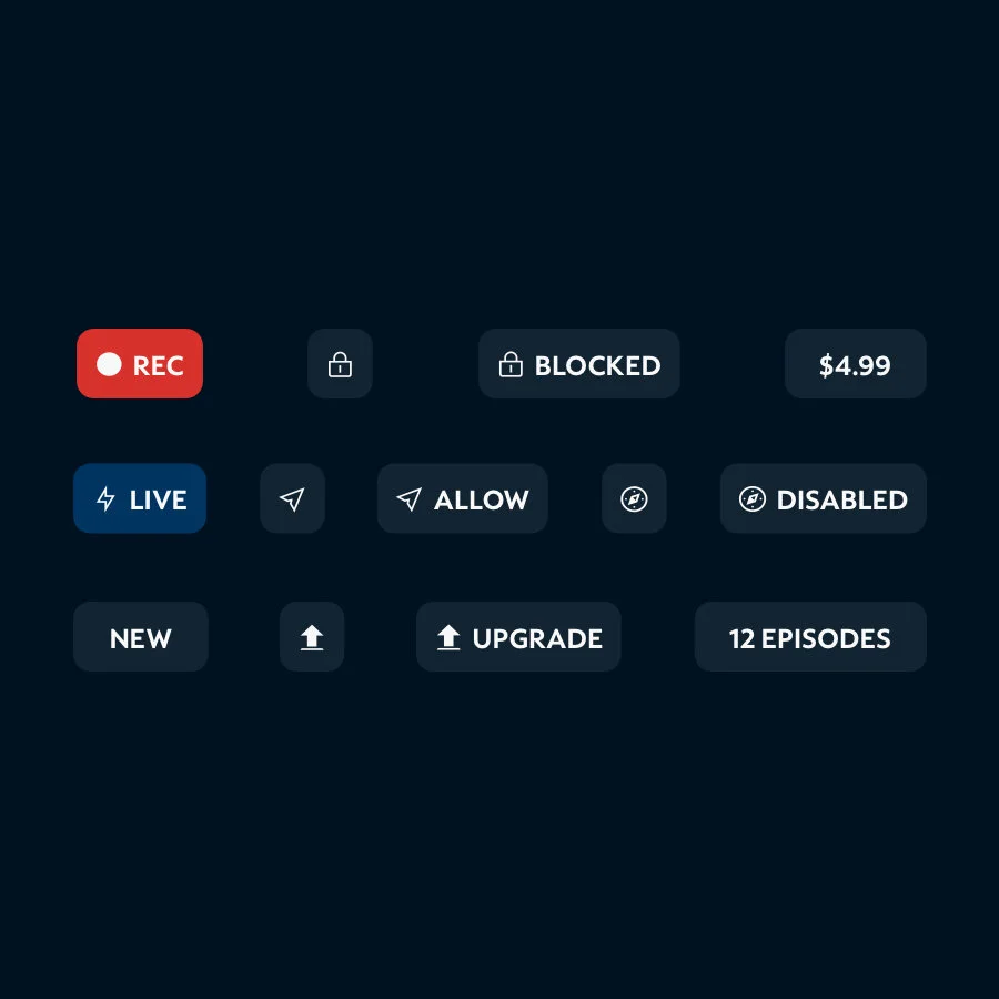
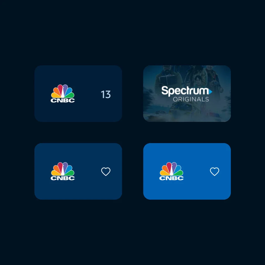
Rounded
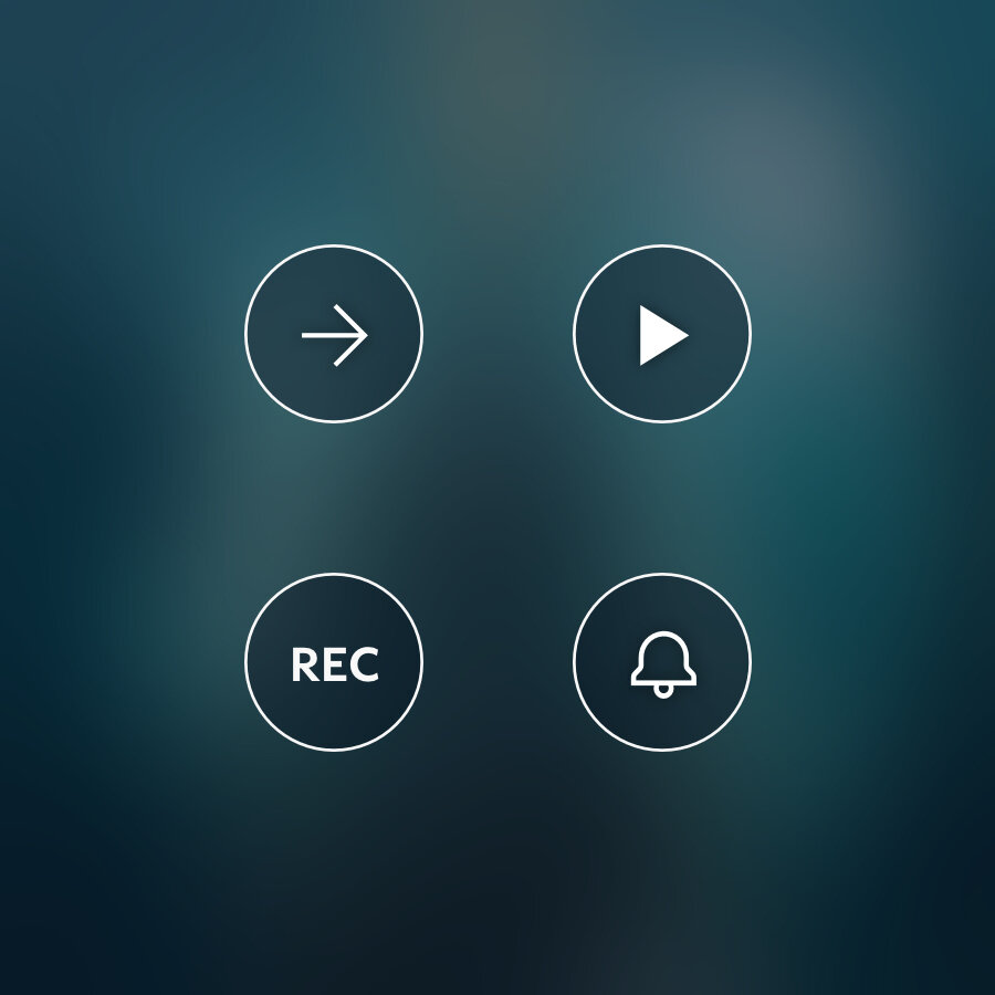
For a more welcoming, soft and friendly feel we have added more rounded corners throughout the sufaces, user interface, and images. Getting rid of those sharp corners that can feel a bit more jarring and edgy. We even added some icon/circle buttons to bring some fully round interface elements in to round it out.

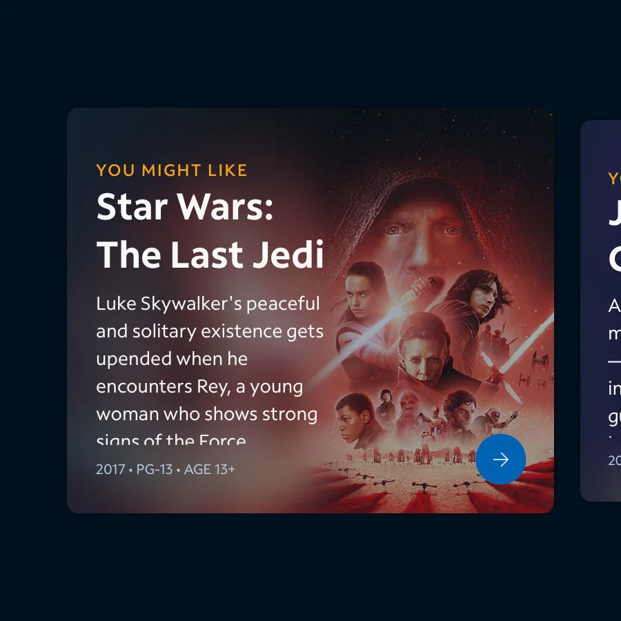
Background Blur
Blurring is a good use of creating elevation and depth that allows our copy to be read while also pulling in contextual colors into the UI. This follows our “Content is King” strategy by changing our UI colors based on the image we are focusing on.
This allows us to make sure we have specific contrast for accessibility while also making our Interface more dynamic and interesting.
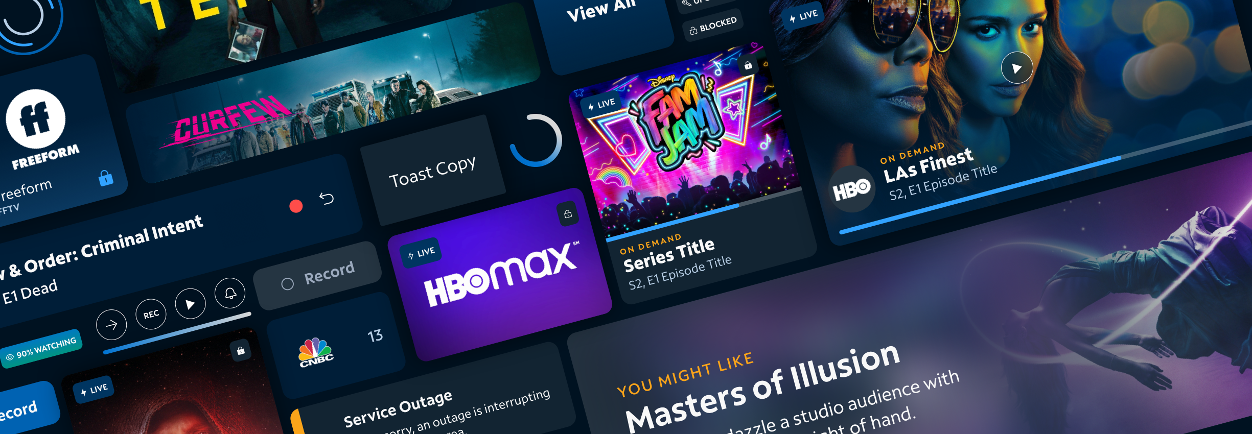
TV Components
Below is a curated example of the types of components I created for this library. These can be mixed and matched to create really interesting content shelves and UI while still remaining consistent to our brand.