VIZIO Remote Control App
Role
Interface Design (UI)
User Experience (UX)
Year
2022
Platforms
iOS
Android
VIZIO wanted to update their Smartcast app to match the new hardware remotes that were being produced for 2022. With this update, they wanted to modernize their app, introduce new branding and provide monetization opportunities.
Phased Approach
Phase One
TV Remote UI/UX.
New Tab bar design.
New Device Selector.
Maintain existing UX/UI for the rest of the app
Phase Two
Audio Remote UX
Integrate feedback from Phase One
More Landing Page Monetization Options
Phase Three
New UI to match the remote throughout the rest of the app.
Custom Buttons.
Current App Research
Inconsistent background and bottom nav colors
Doesn’t look like a VIZIO product, customers are downloading the wrong apps
Two version of remote (skeuomorphic and button version), hard for the engineers to maintain
Dated design, missing hierarchy, cluttered, inconsistent button shapes
Bottom Nav and icons are too large
Teal is the color of our WatchFree+ app, not for VIZIO branding.


(Left) xrt 270 physical remote, this is the new remote design with rounded corners and buttons following the shape of the wheel.
Hardware Remotes
In 2022 we are planning to release a refresh of our TV and soundbar remotes. The goal of this project is to match the software remote to the new xrt 270 hardware remote.
Design Goals based on the hardware remote
Same button orientation and shape in the mobile design
Use tactile gradients and shadows used to symbolize depth
Outlines highlighting the watchfree+ and home button which are our two revenue drivers

HEATMAP & ANALYTICS
We used google analytics to determine which buttons were used a lot on the current app. This helped us to decide what the minimum buttons we could show on the mobile remote while still being a good user experience.
NEGATIVE REVIEWS FOCUS
Connectivity – 14.4%
Audio – 14.7%
TV - 27%
Performance – 7.4%
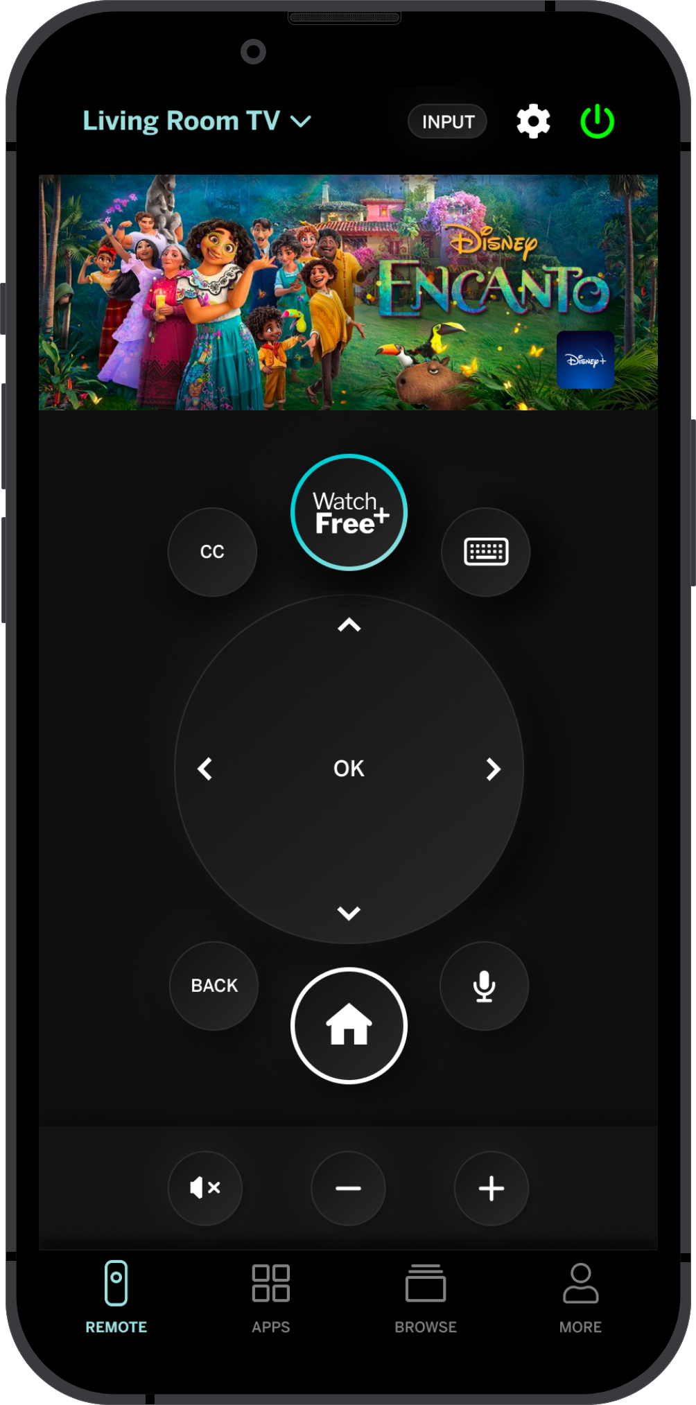
THE UI DESIGN PROCESS
V1 This was a mockup the hardware team presented.
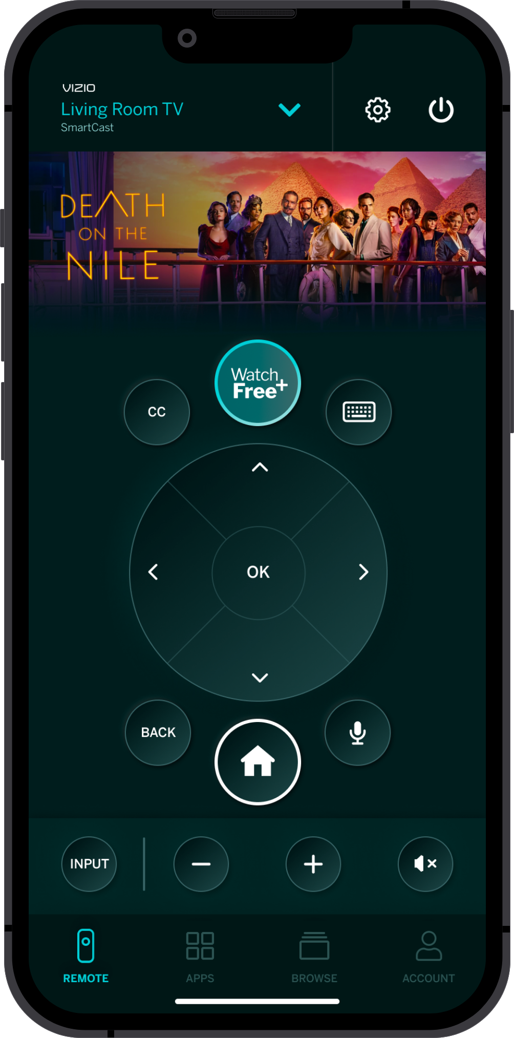
V2 - This mock cleaned up the hardware teams idea while removing features that we can't implement like profiles. It also moves the device selector to the top of the page so it can be consistent throughout the app and adds the tab bar at the bottom back in.
V3 - Feedback that the apps row makes the design too busy. We removed that and added audio to a bottom bar. Removed the white outlines on all the buttons and went with a subtle rendered approach.
V4 - We were asked to implement more color throughout the entire design. We also cleaned up the device selector at the top and added in custom buttons.
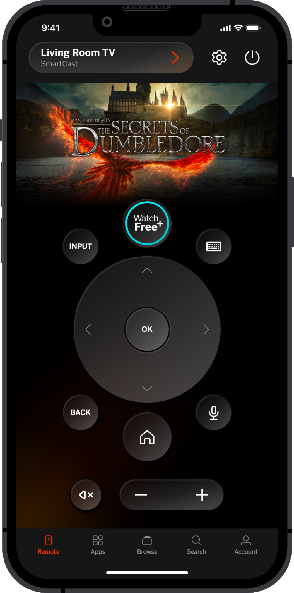
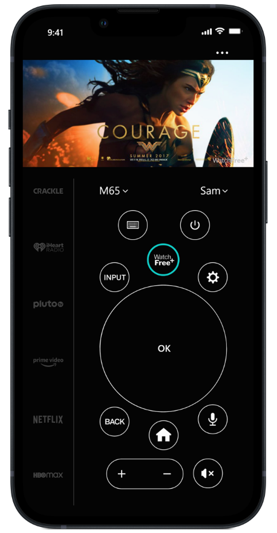
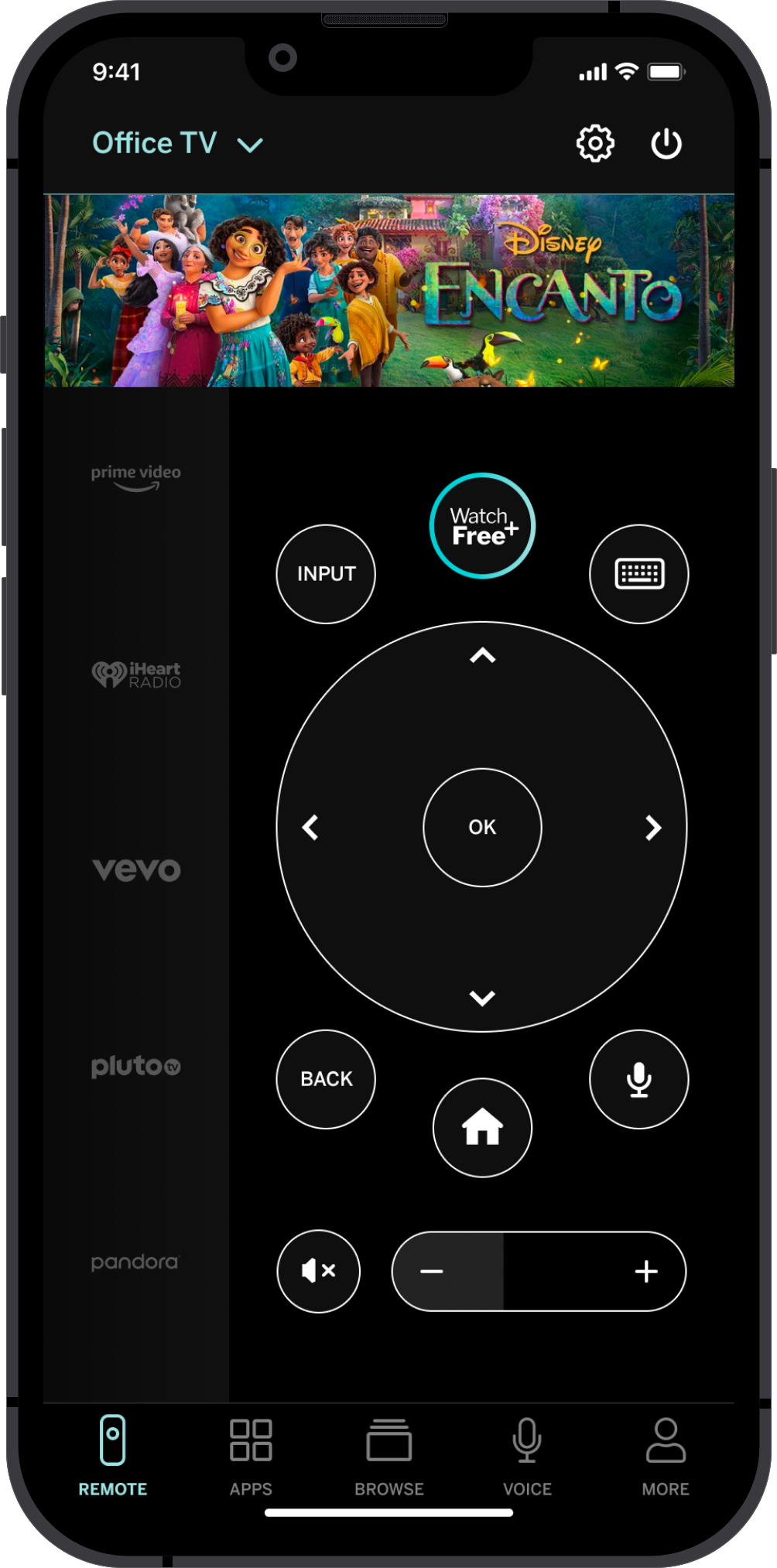
V5 (approved) - Icons are now outlined, our focus state color is now orange. We implemented subtle splashes of color throughout some of the buttons and the background. Cleaned up the rendering of the buttons. Device selector is now a button. We decided to remove custom buttons for MVP.
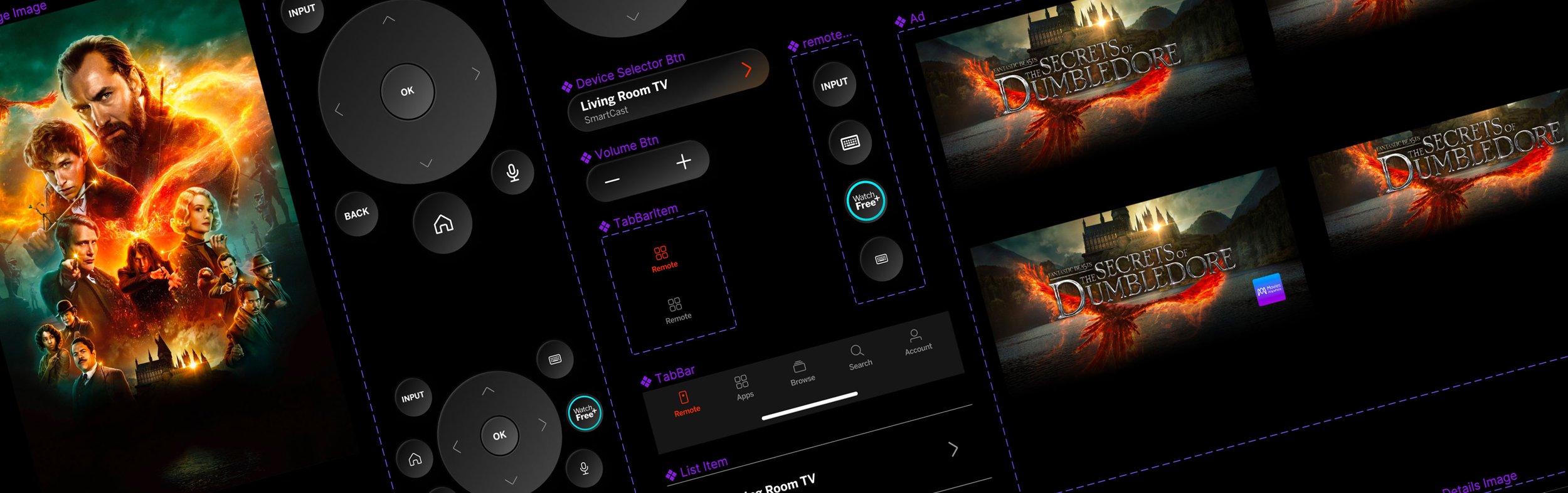

FIGMA COMPONENTS
Once the base remote UI was finalized, I updated my mobile Figma library with reusable components which made building out the rest of the remote pages easy and quick.
Final Designs
Once all of the UI elements were created, I pieced together the rest of the designs needed for Phase 1 of the remote project.


